Simplify to succeed: PayStay
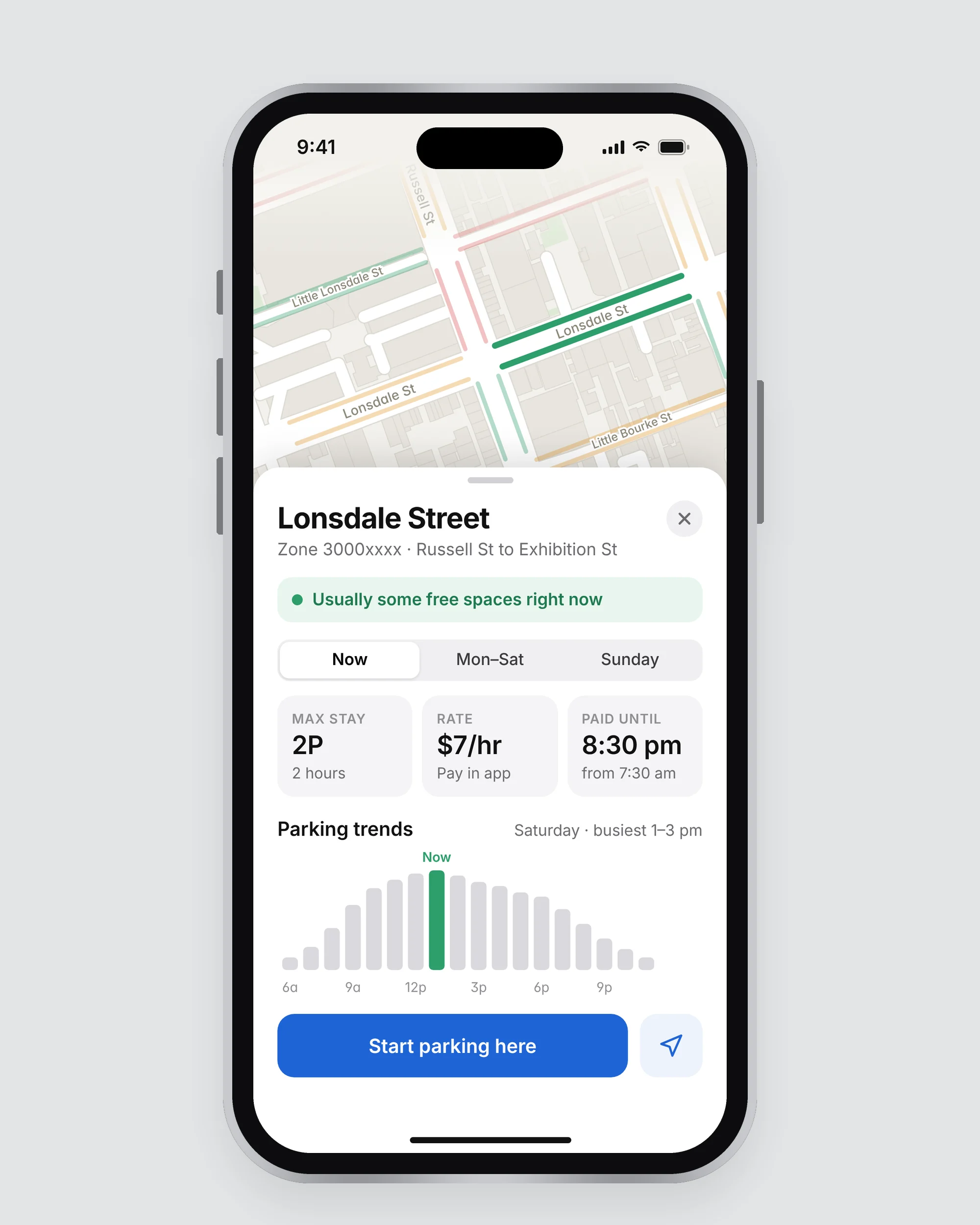
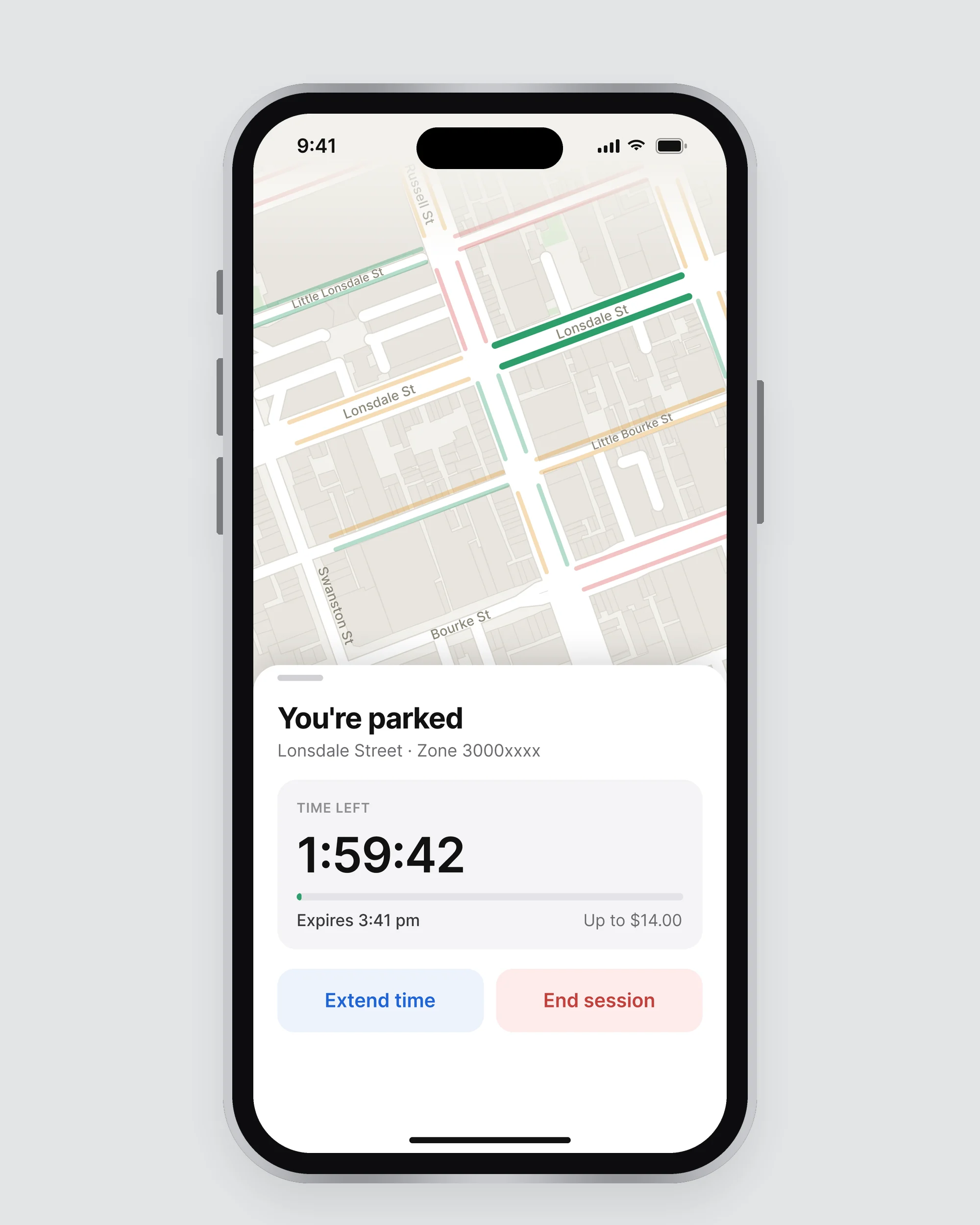
PayStay is the principal mobile payment method for street parking in Victoria. It spreads from the core of Melbourne's CBD right through to the border town of Albury, with more locations constantly being added and authorised.
PayStay users were having trouble understanding and using the Maps function within the app.
Over the period of a week, I followed best-practice design principles and methodology:
- Tested existing designs, helping to identify key issues within functionality
- Conducted contextual market research and design analysis
- Interviewed users to understand their behaviours, and how a solution might affect them
- Created and tested a solution to gauge usability and feasibility
- People like to plan ahead when it comes to parking.
- People with parking "spots" they're familiar with return to them frequently.
- Even so, they still needed flexibility, for the unforeseen.
But the key insight was…
People were unsure where to find the information they were looking for.
Heuristic analysis showed the information users were seeking already existed. The solution took that existing information and presented it in a more recognisable format.
Revisited in 2026 with an updated visual design.
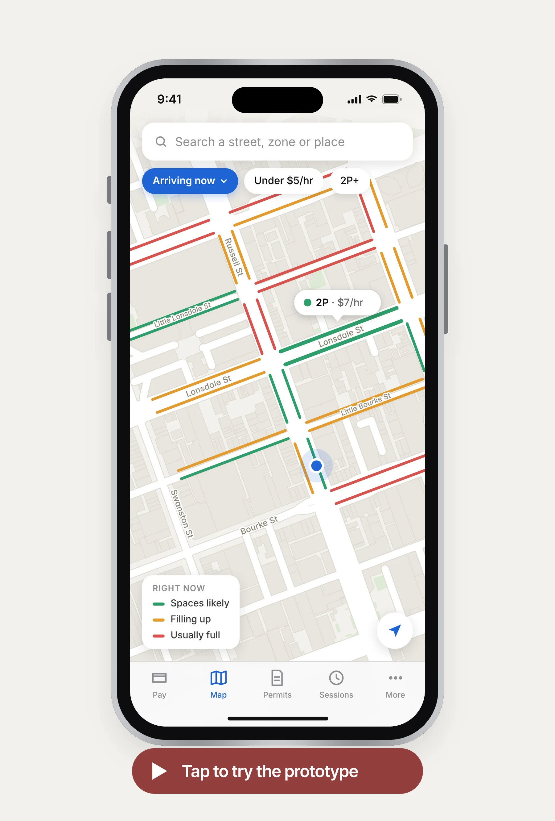
Reduced the time it took all test users to find the information they were seeking, including bay availability and trends, metered times, the cost of parking and bay information.